


windscreen comprised of 26 3.5’ x 7’ laminated ¼”safety glass panels with a printed interlayer
A canoe, imprinted with a map of the tree-lined Rahway River, appears to glide above downtown on a river of Cranford street names, and features historic tile imagery, including color scheme and typical silhouettes, along with lanterns reminiscent of past river festivals and the Cranford Canoe Club.
Ten banners of varying lengths hang perpendicular to the school facade, each pair featuring an element-oriented color scheme.
As one gets closer, it becomes clear that the color of each pair may be similar, but the surface pattern is not. One “wing”, or grouping of five banners, appears to have flowing parallel lines reminiscent of feathers, while the other “wing”, or grouping of five banners, has photographic views of the actual element associated with that particular color; each of these banners displays degrees of magnification, similar to the Eames’ Powers of Ten film, in which each view is taken closer than the previous one.
As one walks by, the colors of the banners seem to shift; the elements/colors are different on each side, making for a transformative viewing experience depending on the direction of one’s approach.
A large paving insert in the form of an abstracted feather, with veins on the feather made up of Brookland street names, will be inlaid in bronze within a concrete or exterior terrazzo surface. Every street name in the neighborhood, small or large, will be represented within this, as a way of acknowledging the history of Brookland.
When reading about the development of Brookland’s name through its earliest inhabitants, it became clear how much the names of past residents and the names of streets interconnect. Those whose surnames are not reflected here still have a connection to the name of the place they were raised. Because Brookland is a neighborhood school, it is likely that every student will recognize at least one of these street names as theirs, and others belonging to their friends, their route to school, etc. While many of the students who start school this year will most likely move on some day, the street names will always be relevant to new students as well as those from the past.
Using the feather, and its obvious relationship to wings, as a way of listing these meaning-laden names, rather than a map, directs the focus to each street equally, without than injecting some sort of hierarchy. With the conceptual essence of the world swaying on the wing-like banners above, and the feather like fossilized personal evidence below, the macro and the micro, the past, present and future, are visually connected.
One of the prominent features of the outdoor classroom is the area at the south end provided for solar panels as a learning tool. The view from here is invigorating, and seems to invite some sort of visual call and response. A pair of solar powered wings which hover above the classroom and are illuminated a brilliant turquoise at night, visible for blocks around when viewed from the east, will unite these two features of the space. Both the school identity, and its sustainable design, would be broadcast through a form that has always been romantic and elusive to humans, a great pair of wings. When students want to identify which school they attend, they can immediately respond with pride, “I go to the one with the wings”.
The Brookland entry plaza is never totally unoccupied; both wind and water pass through all year long. A series of wind vanes that reflect the direction, consistency, and force of the wind will express this ebb and flow, and make it tangible to students, Vane ornaments will feature silhouettes of Pegasus, the school mascot, varying in height from ten to fifteen feet high, and would be scattered along the length of the plaza sidewalk parallel to the school façade. The casual, somewhat linear layout of these verticals will appear to support a pre-flight, nearly alight, herd of Pegasus. Depending on the wind conditions, the direction the herd faces will change, ranging from orderly alignments to colorful disarray. The wind’s behavior will be immediately visible due to the coloration of the Pegasus ornaments. Just as students wait for rain or snow and announce their earliest sighting to the class, defined wind direction will become another window gazing sport. The slightly maze-like arrangement of poles can provide entertainment, a spatial organizing device, or something to lean on for both students and parents waiting for pick up connections and transportation.
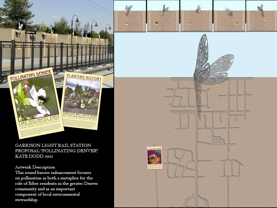
This artwork focuses on pollination as both a metaphor for the role of residents in the greater Denver community and as an important component of local environmental stewardship. Just as plants depend on insect pollinators to stimulate growth, cities depend on commuters and public transportation to create a rich and diverse urban entity.
The Eiber neighborhood’s emphasis on an agricultural past and current xeriscaping and sustainability issues means that plant pollination has always been and continues to be an integral part of local life. An interest in developing indigenous pollinators, partly by planting the native species that attract them, in the face of diminishing honey bee populations is especially urgent. The Garrison station provides an opportunity to support symbiotic relationships on both the macro and micro level.
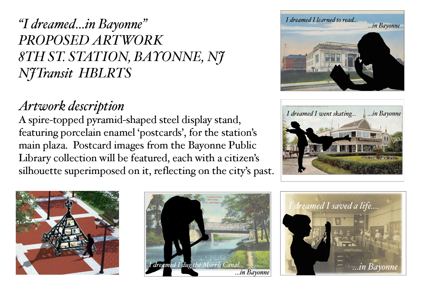
" I dreamed...in Bayonne"
A spire-topped steel pyramid display stand, which echoes the architecture of the existing train station, features porcelain enamel 'postcards' displayed on the station's main plaza. Postcard images from the Bayonne Public Library collection will be featured, each with a citizen's silhouette superimposed on it, reflecting the city's past while echoing the Maidenform ad campaign of the 60s and 70s.
"Swoop" consists of a translucent enclosure with a dramatic undulating profile, reminiscent of waves. Its double circle footprint, similar to the symbol for infinity, allows visitors to navigate their way through its maze-like interior.
The entire structure features a positive ‘green’ message as well. The translucent walls of the entire structure, built of plastic bottles recycled by the local community and encased in plastic netting to create patterns of shifting hues, suggest reflections in water as they encircle the wooden frame. Dramatically lit at night, these parallel bands will glow with rich color, functioning as a magical lantern in downtown Atlantic City.
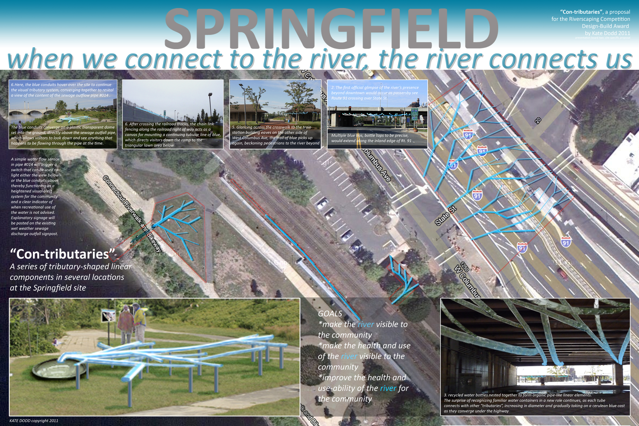
“Con-tributaries” is an initially benign illustration of the river, as a set of tributaries that merge, and yet it reflects the grim reality of human activity as it converges with extreme wet weather events and physically overflows into the Connecticut River.
In echoing Dr. Seuss’ stylistic treatment of peripatetic plumbing, Con-Tributaries creates an inviting and playful approach to lure newcomers to the river from downtown Springfield, MA. Once visitors have identified a path to the riverbank, the stage is set for presenting the story of Springfield’s current relationship to the river. Upon arrival, the scenic presence of the river speaks for itself, and yet the typical resident’s understanding of the river’s health and use, by their very own community, may not be so immediate. This is where the awareness of Springfield’s continued use of CSOs comes into play, as the sculpture element in the competition-designated site educates visitors to this continued and destructive reliance on the river as a convenient removal device for human waste. Familiar recycled materials are incorporated into the artwork to further emphasize needed reconsideration of conventional approaches to the communal waste stream.